This is a design concept for a bakery that specializes in macarons that are colored to represent your birthstone. Not of great product significance, but I thought the visual design was very appealing.
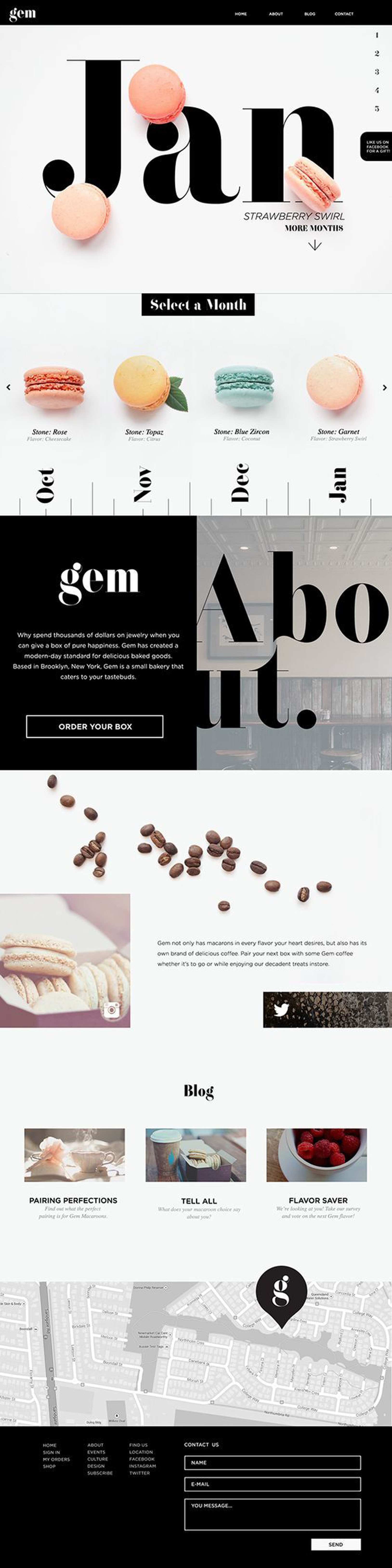
The first thing that strikes me is the balance of positive and negative space. The typography is bold and stands as the prominent visual element throughout the page, creating a rhythmic hierarchy. I also appreciate how they’ve used the blocks of color against blocks of type to display points of interest. The use of bleeds within smaller image areas creates an intimate, palpable visual experience.
The use of a grid is subtle, as there the good spacing of visual elements, but when you look closely, you can see how different areas are divided spacially. And those macarons!