July 2018

Good Visual Design Example 2: Shore Projects

This is a watch company based out of the UK. I love their watches, but their website’s UX/UI experience got me hooked (along with some beautiful packaging)

The design here is simple, just as it is across all their pages, creating a nice visual flow and pattern. Allowing ample positive and negative space within the page makes choosing your selections simple and intuitive. Typography is minimal, but varies enough to show clear hierarchy of information. The use of bleed in the images draws you into the layout.

Great product, design, and presentation. A double thumbs up to Shore Projects.

Gem (Bakery)

This is a design concept for a bakery that specializes in macarons that are colored to represent your birthstone. Not of great product significance, but I thought the visual design was very appealing.

The first thing that strikes me is the balance of positive and negative space. The typography is bold and stands as the prominent visual element throughout the page, creating a rhythmic hierarchy. I also appreciate how they’ve used the blocks of color against blocks of type to display points of interest. The use of bleeds within smaller image areas creates an intimate, palpable visual experience.

The use of a grid is subtle, as there the good spacing of visual elements, but when you look closely, you can see how different areas are divided spacially. And those macarons!

Yale School of Art (Yes, that Yale)

Bad Visual Design Example 2: Yale School of Art (Yes, that Yale)

It’s surprising to me that an Ivy League’s art school is represented so poorly on their website. I suppose that Law (not Art) might be their stronger suit.

So the dogs are cute, right? How about that tiled background? Not so much. Maybe if they used the tiles as a grid, the design might work better (silver lining). What’s sticks out to me most here is the total lack of figure/ground relationship, or positive/negative space. They’ve used every last pixel to fill with color, type, or imagery, and the small font sizes show almost no typographic hierarchy.

I think from a UX perspective, this design is even worse than it is visually. There really isn’t any flow between areas of information, and the content reads as a list of words, rather than any informative call to action.

Now for the good stuff!

Good vs. Bad Design

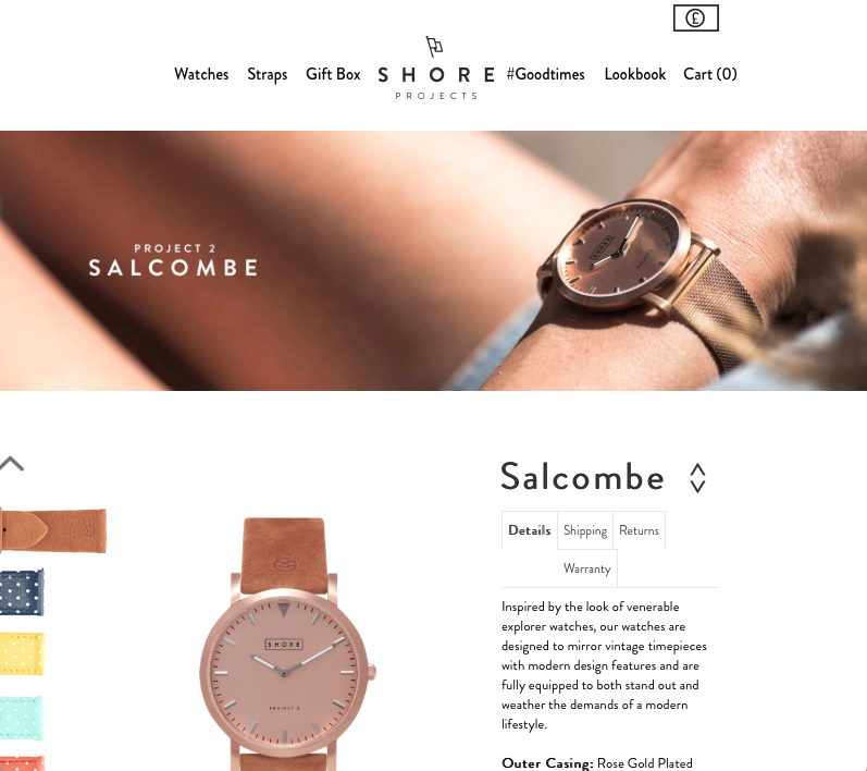
This week we covered visual design principles including the “Golden Ratio”, which is essentially the mathematical basis of the Gestalt Theory. Gestalt supports the notion that visual elements should be viewed as a whole, rather than the sum of separate parts. How these elements interact to create the big picture will determine the aesthetic appeal and ultimately support or hinder the usability of a product.

Do you want the good news or the bad news? Let’s get through the bad examples first (you might want to put on your shades for these).

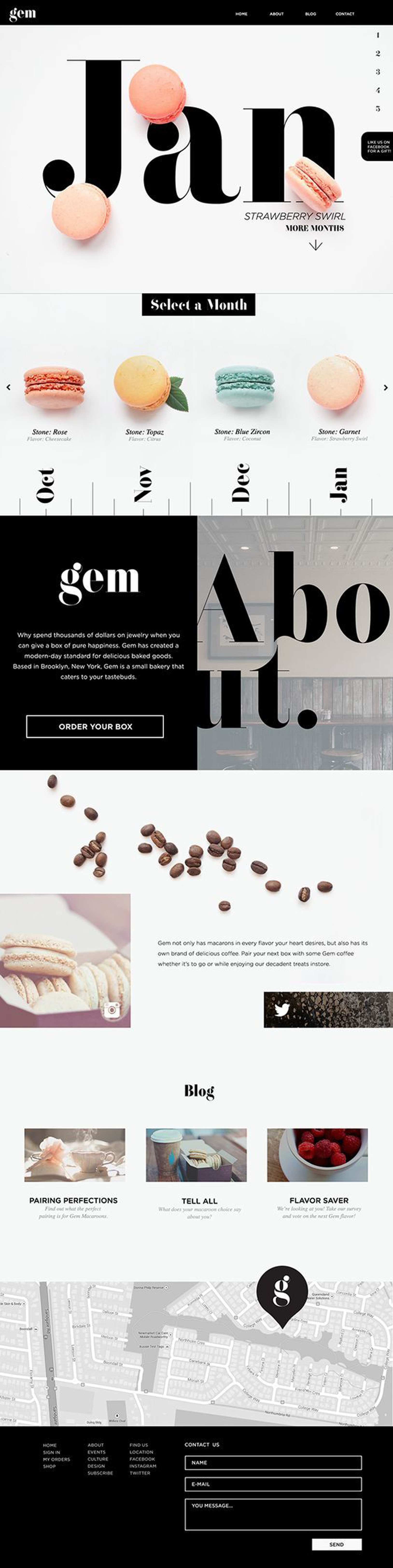
Bad Visual Design Example 1: Lumber Liquidators

Sorry guys. I just purchased some great floors from you, but your User Interface didn’t make it easy. Here’s what I’m talking about:

To cover some of the principles we discussed in class this week, let’s begin with visual hierarchy. I think we can agree that they’ve used lots of type sizes and fonts to call out pertinent information, but the weight and contrast of the typography juxtaposed to the background colors and images makes everything difficult to read. The margins in each content section are small, limiting negative space for a cluttered design.

There is a grid system in place, as you can see with the 4/2 ratio, but the clash of colors, patterns, limited white space, and inconsistency of type treatment creates an overall look of disorganization.