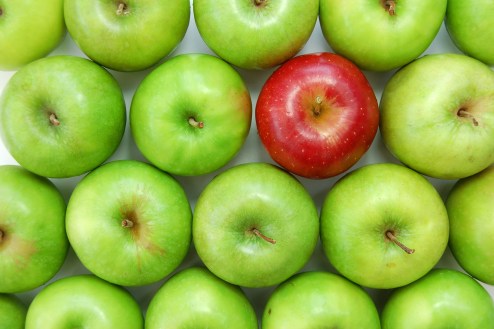
Let’s think about the last time you visited the produce aisle at your local grocery store. You know you want Honeycrisp apples because they are crunchy and sweet, a familiar taste that pairs well with the gruyere cheese you love. You come upon a giant mound of apples, all ready for the taking, but which ones doRead More

Design Saves Lives
Design is not brain surgery, but it certainly has the power to save lives. Just imagine a world without the design of traffic lights or street signs. Sounds pretty dangerous, right? Just as traffic signs help us navigate the road, the design of healthcare marketing helps us navigate the hospital systems from which we receiveRead More
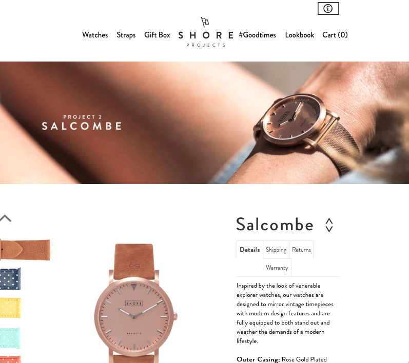
Good Visual Design Example 2: Shore Projects
This is a watch company based out of the UK. I love their watches, but their website’s UX/UI experience got me hooked (along with some beautiful packaging) The design here is simple, just as it is across all their pages, creating a nice visual flow and pattern. Allowing ample positive and negative space within theRead More
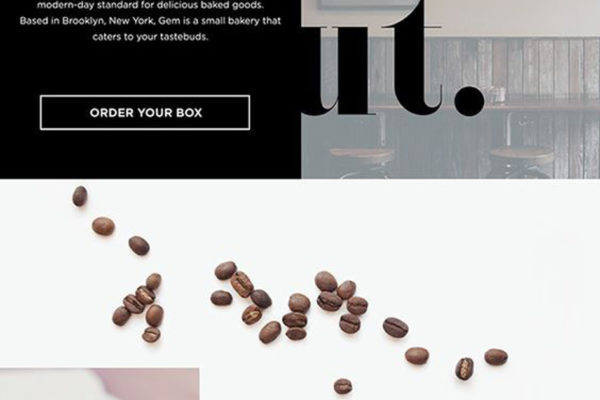
Gem (Bakery)
This is a design concept for a bakery that specializes in macarons that are colored to represent your birthstone. Not of great product significance, but I thought the visual design was very appealing. The first thing that strikes me is the balance of positive and negative space. The typography is bold and stands as the prominent visual elementRead More
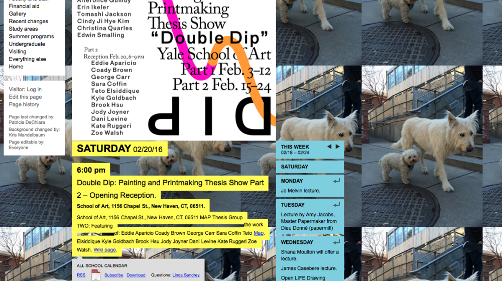
Yale School of Art (Yes, that Yale)
Bad Visual Design Example 2: Yale School of Art (Yes, that Yale) It’s surprising to me that an Ivy League’s art school is represented so poorly on their website. I suppose that Law (not Art) might be their stronger suit. So the dogs are cute, right? How about that tiled background? Not so much. Maybe ifRead More
12