Bad Visual Design Example 2: Yale School of Art (Yes, that Yale)
It’s surprising to me that an Ivy League’s art school is represented so poorly on their website. I suppose that Law (not Art) might be their stronger suit.
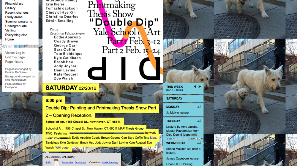
So the dogs are cute, right? How about that tiled background? Not so much. Maybe if they used the tiles as a grid, the design might work better (silver lining). What’s sticks out to me most here is the total lack of figure/ground relationship, or positive/negative space. They’ve used every last pixel to fill with color, type, or imagery, and the small font sizes show almost no typographic hierarchy.
I think from a UX perspective, this design is even worse than it is visually. There really isn’t any flow between areas of information, and the content reads as a list of words, rather than any informative call to action.
Now for the good stuff!